
Showing posts with label self directed. Show all posts
Showing posts with label self directed. Show all posts
Friday, 11 April 2014

Thursday, 10 April 2014

Wednesday, 9 April 2014

Thursday, 3 April 2014

Thursday, 27 March 2014


Tuesday, 25 March 2014

David Cambria is one of my most favourite artists I’ve found
while researching for my self-directed project, I love all of his work in this
series of portraits. I like how he creates a detailed face from smaller marks,
of different colours, and the uses bigger strokes for the outline and on the
background. I also like how the background isn’t textured as this makes the
painting stand out more, and this will be something I try within my own work.
In this particular painting I like the darkness he uses to create shadows and
the red and blue hints in the face. I like how the majority of the portrait is
built up using skin colour. I also think the strokes are expressive and
interesting to view. His work is definitely something which inspires me, his
paintings are my favourite that I’ve come across.
Within my own work, I want to push myself using this sort of
style to create portraits, and going larger than I have done before, I think this kind of style will be
interesting to experiment with and quite fun to do too.
Wednesday, 12 March 2014

Andrew Salgado is one of my favourite artists I’ve come
across since starting my research for my self-directed project, the way he
builds up a face or a figure using colour and strokes is really good, and
something which inspires me. I want to be able to create paintings to a similar
standard of these one day and they are definitely something to look up to. In this
painting in particular I like how the colours start of warm and then fade down
into a variety of blue tones. I like how even though it is an expressive style
the detail hasn’t been lost in the face, especially in the eyes.
Monday, 3 February 2014
Self Directed Statement (so far...)
I have decided to develop my previous project but look at
using different painting styles such as oil paints. The topic of my project is
blank expression, within this I will look at using light in my work to create
depth and seriousness. The main media I want to work in is oil paints. I want
to capture people of guard and then turn these photographs into paintings. Creating
sketches and experimenting with different materials I hope that these will
inspire my paintings. I want to experiment different back grounds using oils,
such as dripping like some of my previous water colour work. I previously
looked at Sally Manns ‘face’s series, which inspired me to photograph people
off guard. Some artists I have also looked at are Andrew Salgado and Dan
O’connor. To develop my work from here I want to experiment more with oils,
working on a larger scale and loosening
up more with my technique.
Thursday, 30 January 2014

Masri
Hayssam - Dolcia – Oil, Acrylic, Gesso 27.6 x 19.7 x 0.8in
Dolcia by Masri Hayssam is a very expressive painting in
terms of strokes and gestures created by the paint. The features on the face
are very prominent and stand out from the rest of the face which almost creates
a background as it’s painted so loosely.
The colours are mainly blue tones giving it a cold tone and also makes
the painting seem like there is a deep emotion behind the eyes. The thick lines
and strokes are quite messy and rough but are placed in certain ways to make up
some of the outlines. I really like how Hayssam paints his faces, they look
quite quick, almost like a sketch, and I think that is really effective. I
think this sort of quick style would be something to experiment with.
Friday, 24 January 2014

Jaeyeol Han- Passerby, Comma 13.4 x 8.3 x 1.2 in
I really like this style and how the artist has created the
face using a few large strokes, the minimal use of different colours is really
effective too and could link into how I am currently looking at how colour
effects an images in terms of emotion and mood. The yellow Han has used to
create highlights is interesting and it’s different, however, the features in
portrait are not as clear as some other paintings I have looked at. I do like
how the background is not touched and it is literally just the outline of the
face.
Tuesday, 21 January 2014

Brandi Hofer - The
case of M.Valadamer 20 x 18 x 0.8 in
This painting by Brandi Hofer, caught my eye as I had been
taking photographs, for self-directed, using lighting to create a different
effect and mood in the photographs. A few photographs I have taken have used
red lights, and some of them I want to use to create paintings from. This has
given me inspiration as to how I could include the colour into my paintings,
like I have with my photographs. I also like how the artist has used very
little colour in the face, with only hints of red and yellow to create
highlights and how the background has been bought into the face. The strokes
from the background make it all flow.
Saturday, 11 January 2014

Jeong Ah Lim - An Ordinary Person 9. 20.9 x 17.9 x 0.8in
I like how the artist has used the background to create the
face, by only painting the features and some strokes to make the outlines. The
different coloured backgrounds in her work is similar to the photographs I have
been taking for self- directed as the colours could mean different things and
also can give the painting/photograph a different emotion/mood.
Wednesday, 8 January 2014

Oil paint, Spray
paint, wax 19.7 x 15.7 x 0.8in
Although I am not keen on the colours used in this painting or the face itself, I like the build up of textures and the fact Donaldson has used lots of different mediums to create the painting is very interesting. I also like how the right hand side is not of the background is not as textured as the rest of the painting. I think looking into how he’s worked spray paint and wax into the painting could be something which would be interesting to experiment with for my Self-directed project.
Friday, 20 December 2013
Paint - Write up
I
chose to go with ‘the body and/or self’ and within this I chose to go with
‘expressive’. I began to look at different styles of expressive painting mainly
of portraits. While researching different artists I came across Paul wright,
who’s art work is very textured, as he paints in a messy style, with different
strokes almost blurring the face, it influenced my work into moving into ‘blank
expression’. I wanted to paint portraits of people with a ‘blank expression’,
so the audience has to read into what the person may be thinking or seeing. I
also looked at Catherine Hennessey, who works with water colour and ink; she
creates very meaningful images that bring across an emotion, often without
showing the whole face. I liked the style and media she used for her work, and
this ended up being similar to the route I have decided to go down. An artist
similar to this that I also looked at was Agnes Cecile, she mainly paints with
water colour and ink, some of her work is very expressive and loose, where as
other pieces are precise. She uses a lot of colour, drips and splashes.
Tuesday, 3 December 2013
Paul Wright

Paul Wright’s art
work is inspiring due to the amount of colour and tone he uses to create the
face. Mixtures or blues, reds, purples, and greens are just a few that he uses
to give the portrait depth, using dark lines to mark out the structure of the
face. He’s painting style is very loose and he works with oil paints.

This painting almost
looks as though the face has been caught while moving, the different lines give
it a blurry effect, the eyes really stand out in this painting. The paint
strokes/marks make the painting more visually interesting to look at.
Wednesday, 27 November 2013
Nick Lepard


I first looked at
Nick Lepard when I was doing a-levels, the style in which he paints still
inspires me, as it is so textured. He uses the paint to create strokes and
marks in his portraits which shape the face and also makes the painting very
expressive. He manages the lose look while still keeping the detail and
expression in the face, and that is what inspires me the most.

Even though this
painting is more tidy, the lines in the face create the shape and expression of
the man. The hints of blue and grey, show a coldness and the tone is very dull.
He is a great artist to look at for my paint project.
Wednesday, 13 November 2013
Sally Mann -Faces
I feel like this collection of images by
sally mann show expressions captured by the people, as if they didn’t know the
photo was being taken. I like the effects from the old camera and the out of
focus features.
With parts of the face being out of focus
this also gives the impression that these were snapshots .
The eyes were very important to me as I
think in sally mann’s images these are the main focal point, they are always
sharp and clear, they almost tell the story of the photograph. The image above
is my favourite out of the collection, as even though the eyes are very dark
they stand out and make you question what is going on in the mans head and what
he is thinking.


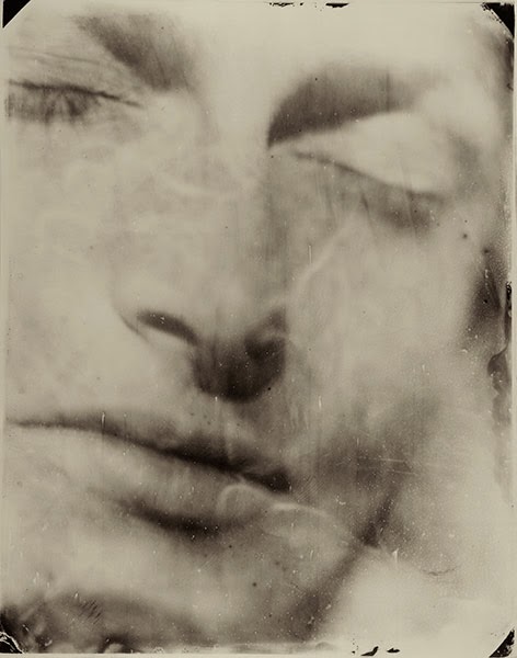
With my own photographs I tried to take
close up photographs of people during conversation to give a more ‘natural’
look. I took photos of different textures to add to my images on photo shop to
try and give a similar effect.
Tuesday, 5 November 2013


Subscribe to:
Posts (Atom)